
A modular editorial system for company-wide news.
Auto-scrolling — hover to pause, or scroll inside the frame
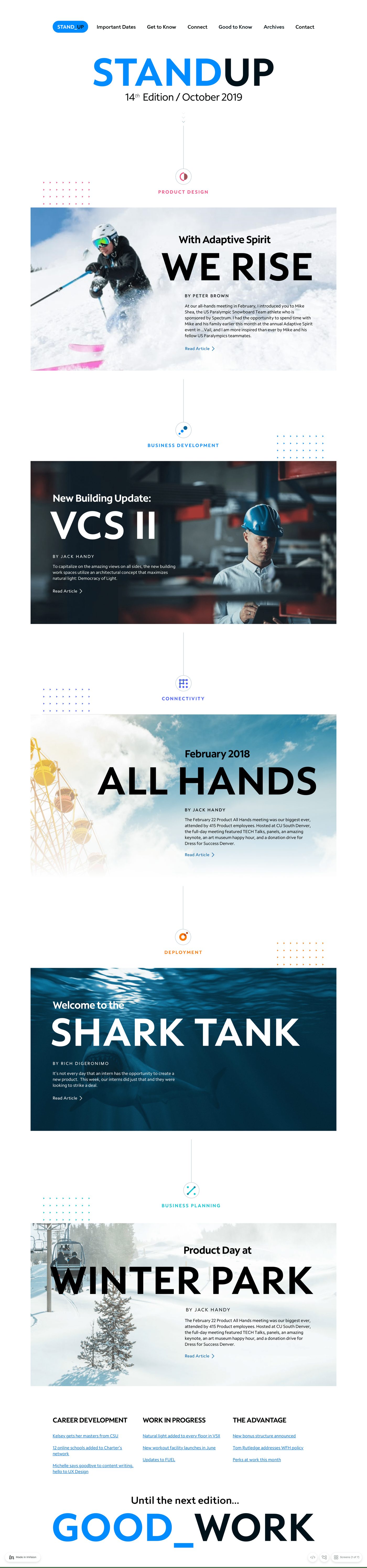
The org had something to say — product updates, business announcements, cultural milestones — and no consistent way to say it. Different departments treated the same internal news channel like a free-for-all: every issue redesigned, every layout improvised, every employee tuned out a little more.
Existing communications lacked clear visual hierarchy, consistent structure across stories, scannable layouts for busy readers, and a flexible system that could scale issue over issue. Important messages were getting diluted by the format.
Lead UX / Product Designer for the entire surface. Responsibilities:
I started by auditing every recurring communication across the org, looking for shape rather than content. Stories naturally fell into themes — Product Design, Deployment, Business Planning, Connectivity — which became the structural framework.
Rather than designing static pages, I designed an editorial system. Reusable blocks meant future issues could be assembled, not recomposed:
Each issue could now stay consistent without redesigning from scratch — the discipline that separates a magazine from a memo dump.
Most internal-comms readers are skimmers. The layout had to make the most of three seconds of attention:
The goal: make internal content feel intentional, not transactional.
STANDUP gave the org a structured way to communicate updates across multiple departments without overwhelming employees or diluting key messages. The system shipped 14+ editions and is still the template the company uses to talk to itself.