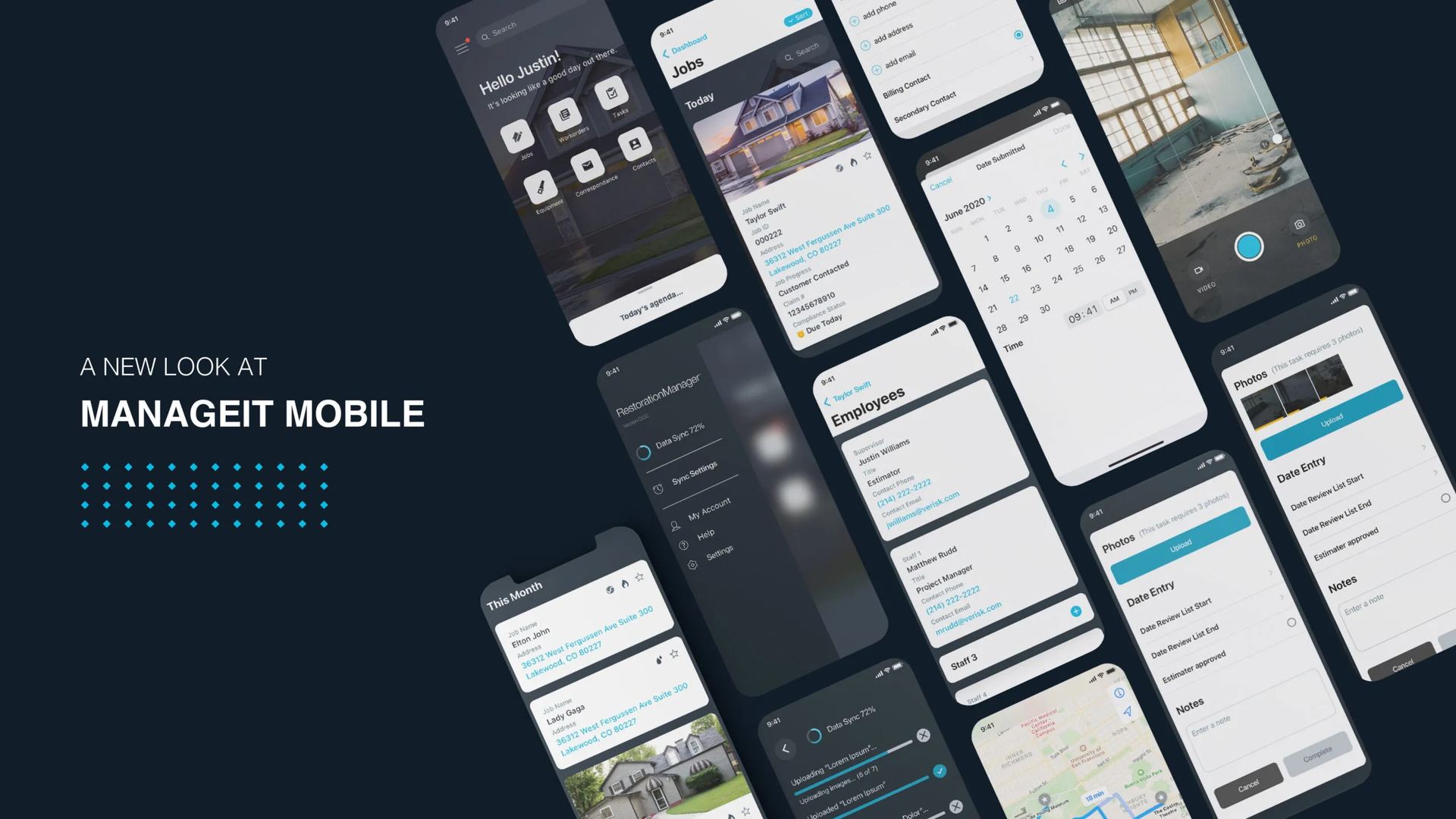
A new mobile experience for technicians, project managers, and office staff.
Bringing a fifteen-year-old desktop platform to where the work actually happens.
A new mobile experience for technicians, project managers, and office staff.
The desktop platform restoration companies had leaned on for fifteen years was thorough — and clearly designed for someone at a desk. The actual work happens in basements with no signal, on roofs in February, in living rooms full of stressed-out homeowners. The brief: build a mobile experience for the conditions the work actually happens in.
The legacy product needed VPN, Windows, and significant training. Field staff had universally adopted the same workaround: capture nothing on site, re-enter everything that evening. Information arrived incomplete, out of order, or already wrong. The product wasn't broken — it was just being asked to do a job it was never designed for.
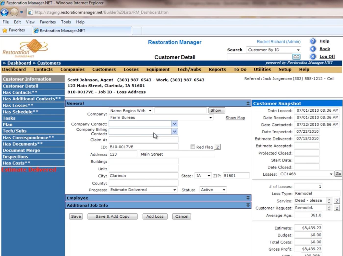
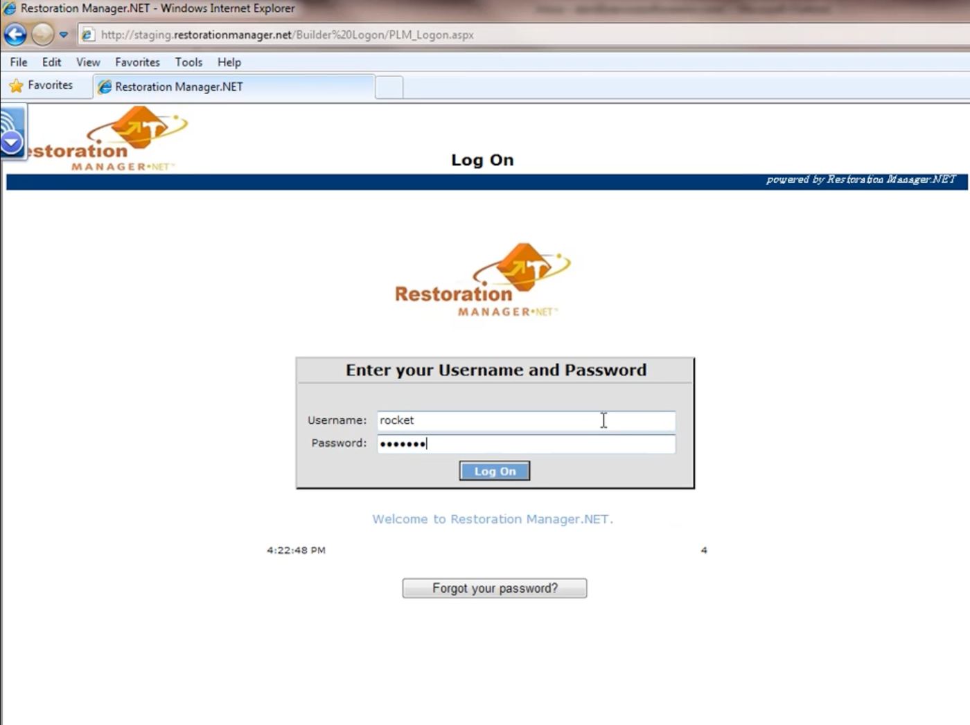
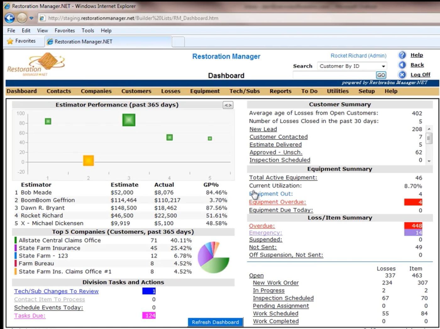
The legacy desktop product — capable, comprehensive, and stuck to a chair.
"I'll just put it in when I get back to the office."
— Field Technician, Day One Of Research
Two months of field shadowing surfaced the same handful of jobs:
The existing system supported the business. It didn't support the people doing the work.
Field technicians need information at a glance — hands full, gloves wet. Project managers live in lists, coordinating multiple active jobs from a truck. Office staff own scheduling and the nightly chase for missing data. None of them wanted a beautiful app. They wanted a fast one.
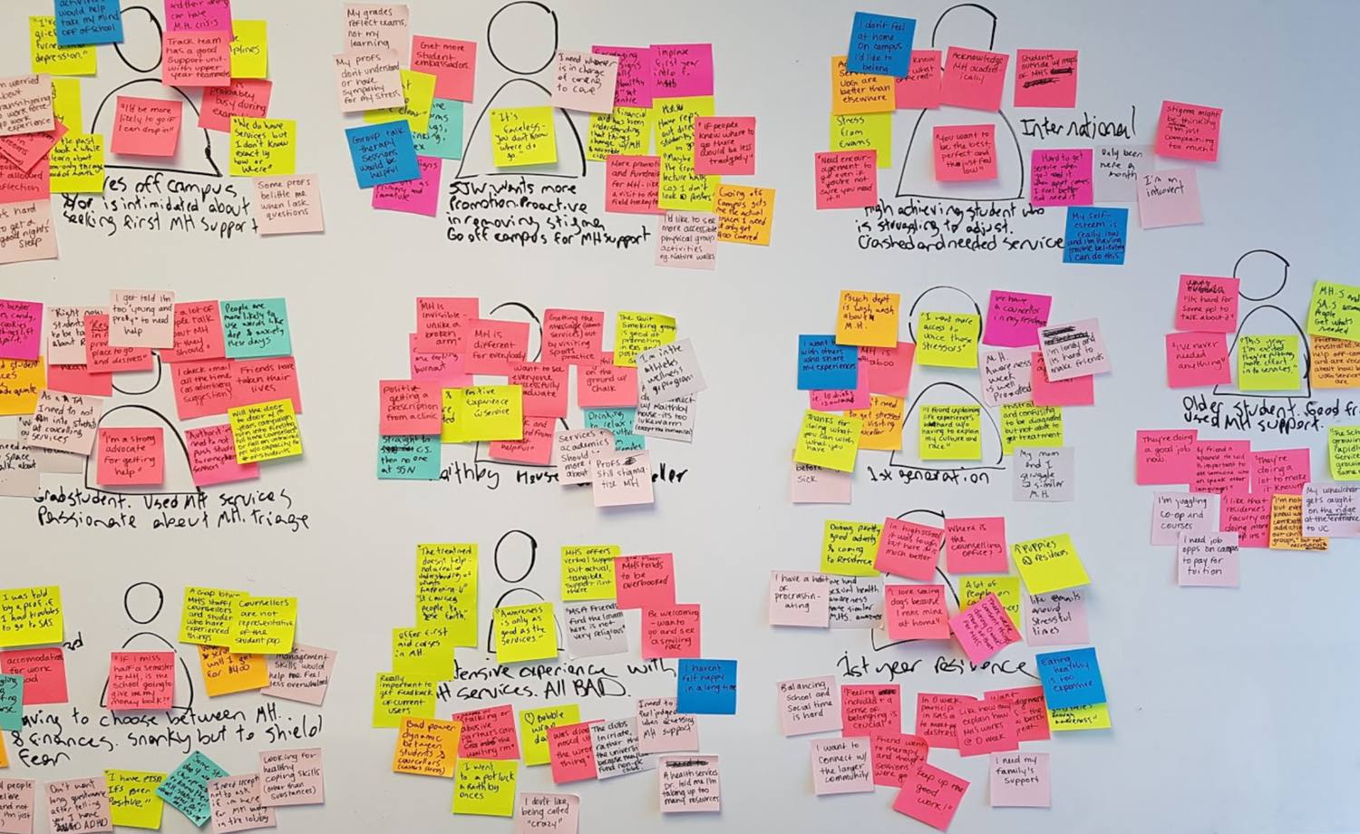
Affinity mapping — clustering field interviews into the patterns that mattered.
One constraint drove everything: the most common tasks should be doable one-handed, in under thirty seconds. The guiding principle, taped above my monitor for most of 2020: make the most common tasks effortless. Everything else can take a tap longer.
The system took shape around four ideas:
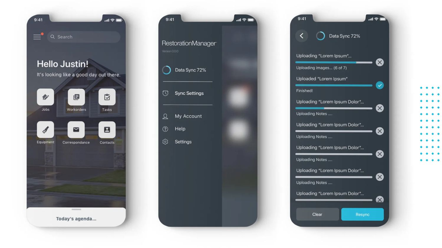
Home, navigation, and offline sync — the always-on backbone.
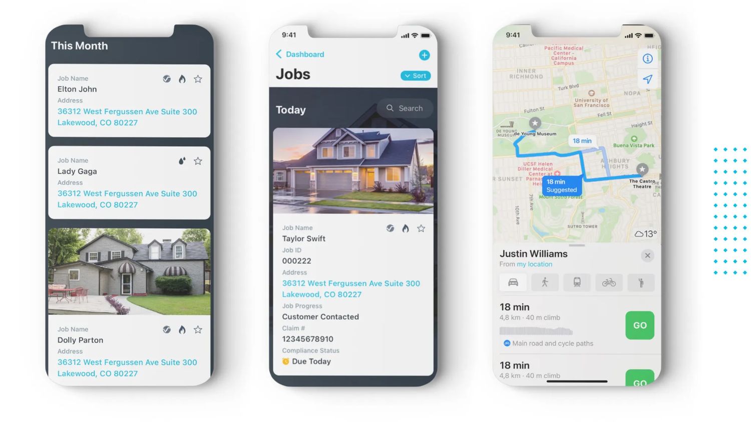
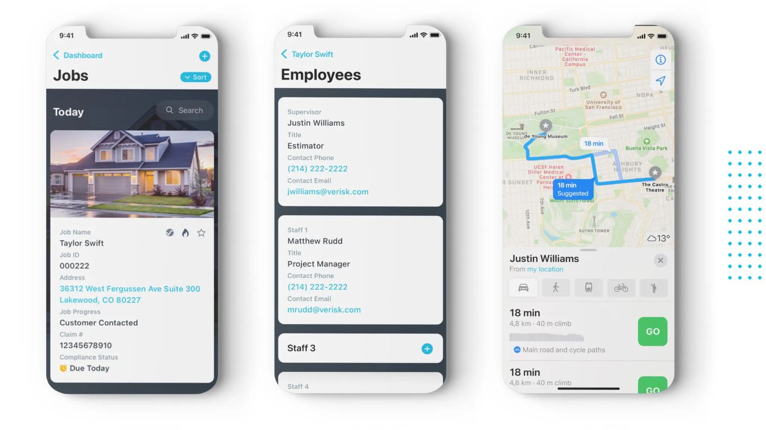
Jobs at a glance — sortable, scannable, photo-anchored.
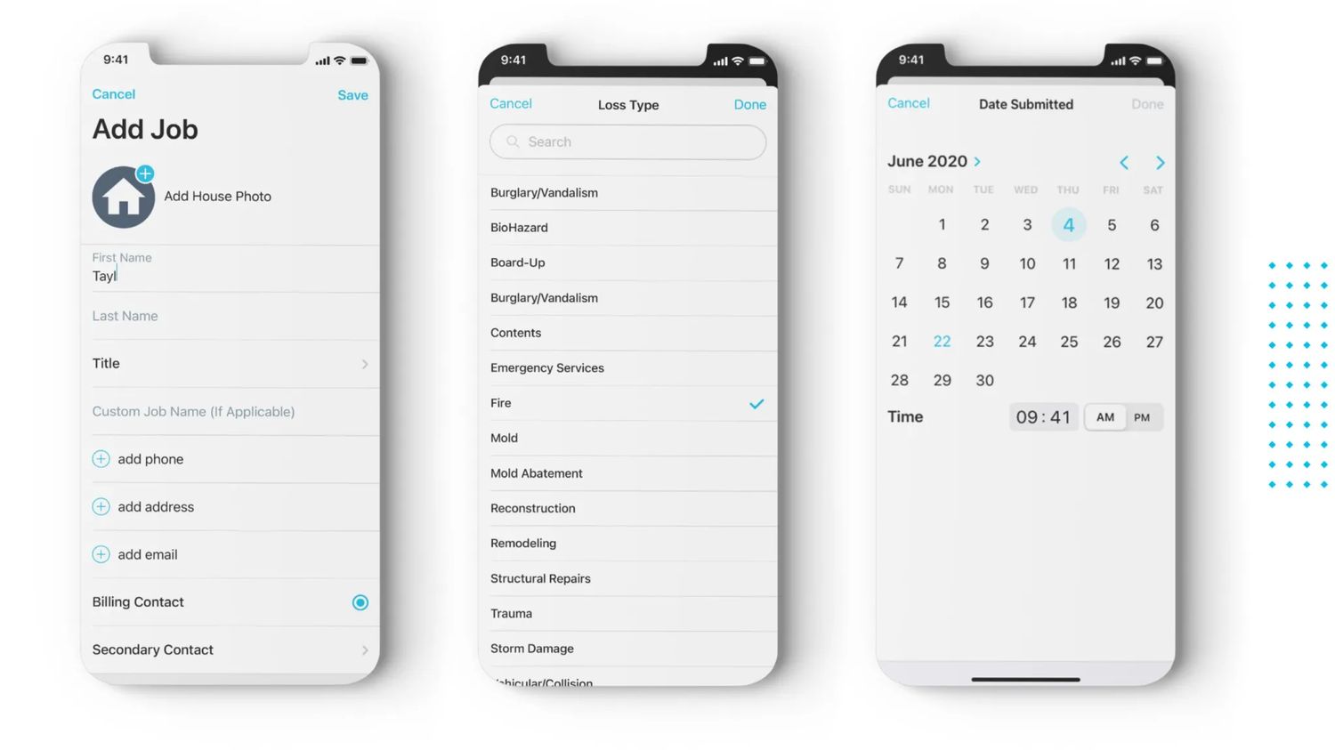
Adding a job — the most-used flow, designed for one thumb in a driveway.
We tested with representative users — actual technicians, actual project managers — performing the tasks they perform every day. Not in a lab. In trucks, on porches, in driveways.
Test scenarios covered the five flows that mattered most:
Watching someone try to operate your design with cold hands at the end of a long day teaches you things a usability lab never will.
Job detail — every piece of context the technician needs, none they don't.
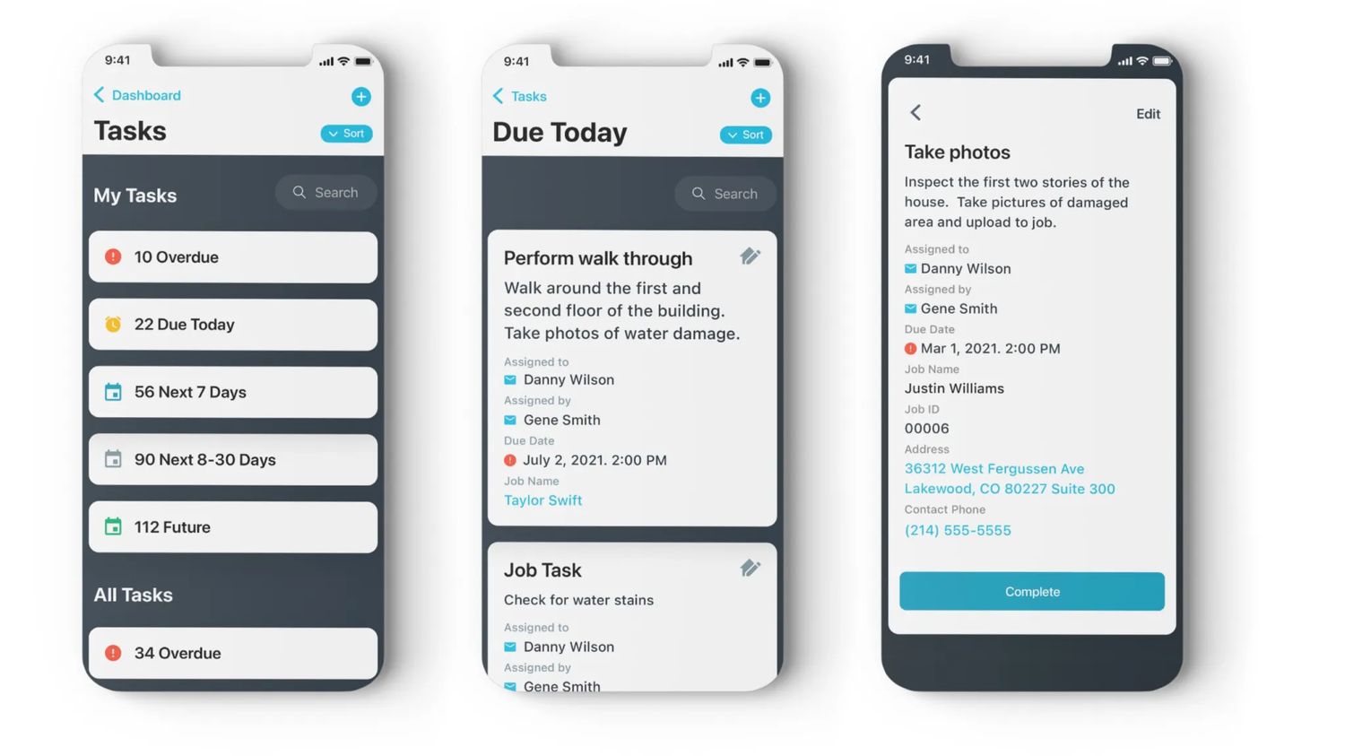
Tasks — bucketed by urgency, never by feature category.
Feedback was overwhelmingly about what we could remove. Users responded well to the simplified mental model and mobile-first approach — the most valuable iterations all centered on getting out of the way faster.
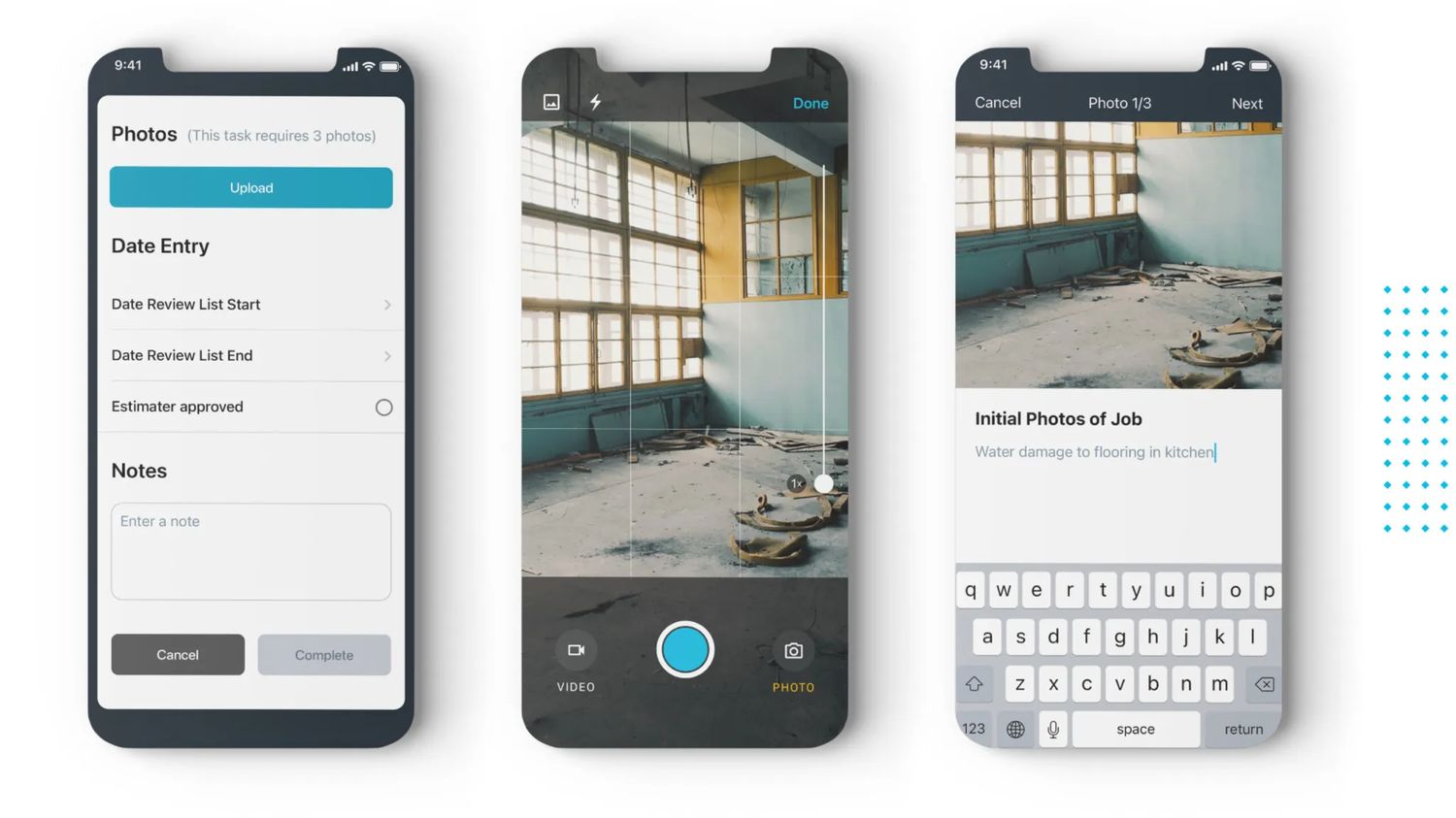
The photo-and-note flow in particular went through six rounds. The version that shipped lets a technician capture three required photos with captions in under forty-five seconds. The first version took three minutes.
Photo capture & documentation — the flow we iterated the most.
Specs, interaction notes, and a versioned component library went to engineering as a single source of truth. The team and I sat together (virtually, this was 2020) twice a week to triage technical constraints against design intent — every compromise documented, every decision attributed.
Close collaboration during build is where most design decisions actually get made. We treated it that way.